Monday, November 29, 2010

Its coming together...slowly but surely


The poster still has some kerning issues I need to work with.


The Homepage is where I want it, I still need to fill in the green boxes below with some javascript (aka donation boxes..etc...) Also I need to make the text in the main box a bit smaller...
Click here for the Website :)


Monday, November 22, 2010

Brochure..

For this brochure, I completely changed the format. Along the top will be a sort of adhesive device to hold everything together in the end, I'm not sure what that will be yet...when I figure it out I'll let you know. As for the logo it will be embossed in the paper, I'm definitely thinking the thicker butcher paper esque style so we can emboss.

As for the 2nd page you see with the Henry David Thoreau quote, I used it because it is what the organization is doing for the kids, getting them ready to accomplish their dreams. This page will be printed on something like tracing paper so you will be able to see through to the next page.

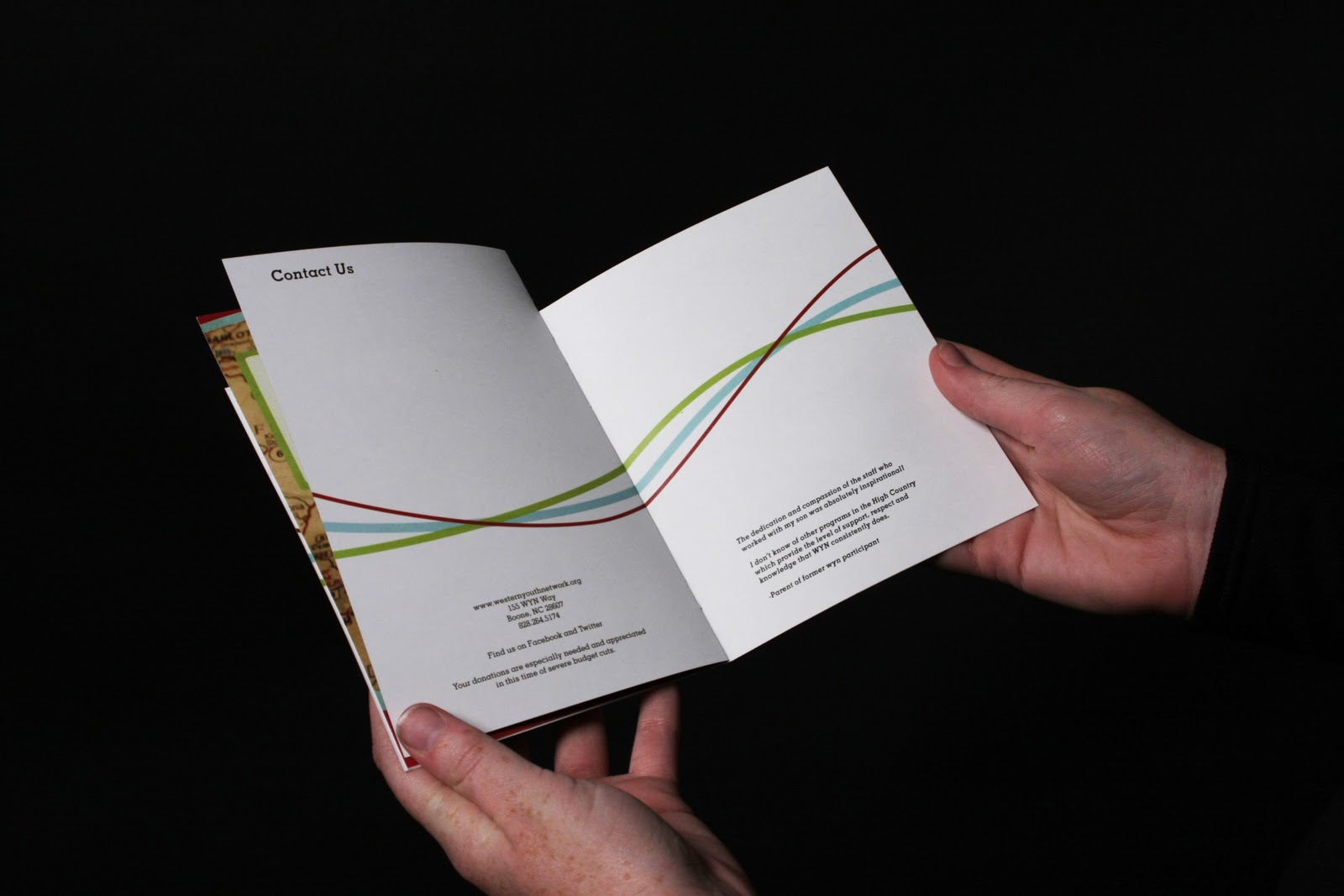
The spread is not fully complete, I wanted to have some time to spend on the sketches to put in the background so there wont be so much negative space.


Tuesday, November 2, 2010

Tuesday, October 26, 2010

Getting Logo Ideas out of my head...

This logo is a re-visit to their old logo. I don't want to be literal with the idea of the mountains, but I'd like it to be subtle so people know where the organization is located. Holly really enjoyed small aspects of the old logo but would like it to be updated. She doesn't want to feature "WYN, or We Dare You."


Driving around the county on Sunday I noticed how every barn in the county has a quilt on it and I wanted to know what it meant. I looked it up on the web and here is the explanation:

"The quilt is a symbol of comfort and family.  Barns are symbol of our heritage and community.  What would be better than combining the two and creating a visual image of who we are and where we come from."

I think this is a great idea to incorporate a quilt-esque pattern into the logo. The Western Youth Network is a family and a source of comfort for many young kids in the local counties and I really would like this to come across in the logo.